The IT team that is quietly powering the entire Skagit Valley College information infrastructure is a talented team of Technology Specialists. This diverse group of enthusiastic developers has helped redefine the way technology is used and have dramatically impacted the future of web development. We were laughing about how small the website looked in the screens of the new large monitors. I mentioned hearing about a flexible website layout that would allow to better use the screen space. My leaders asked me to put together some information about the subject.
I began with the initial research of web frameworks and responsive web technology, and then I presented my findings to the web team. From there we decided to go with a responsive web site rather than creating a separate mobile site. The technology that we have put in to place can now detect a user’s screen size, and then “respond” by changing the web page to best fit the user’s devices from PC to smart TV to iPhones and beyond.
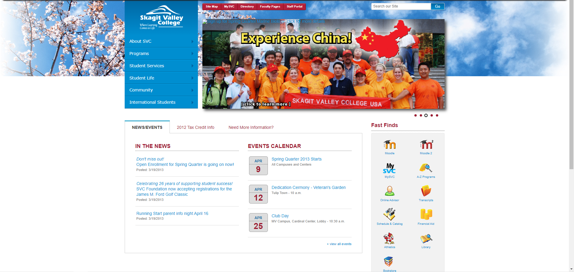
The previous site was built at a fixed size for the monitors of the day.
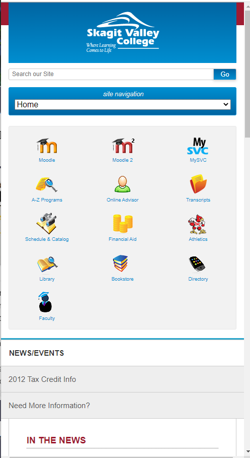
The new design looked great on desktop computers as well as mobile devices.