A space maid is a person who works as a maid in a space station, a spaceship, or a planet. A space maid wears a uniform that is similar to a traditional maid outfit, but with some modifications to suit the environment and the tasks. For example, a space maid may wear a helmet, a jetpack, or a spacesuit, depending on the situation. A space maid may also have some cybernetic enhancements or gadgets to help with cleaning, cooking, or fighting.
Here are variations on how to rotate an object using visual scripting. For this demonstration I made two cubes rotate automatically as well as via user input. One will rotate using the XBox controller and the other one is controlled using keyboard.
using System.Collections;
using System.Collections.Generic;
using UnityEngine;

public class Rotate : MonoBehaviour
{
    Vector3 movement;
    public int xi, yi, zi;


    void Start()
    {
        movement = new Vector3(xi, yi, zi);
    }


    void Update()
    {
        transform.Rotate(movement * Time.deltaTime);
    }
}


Add values to the public variables xi, yi, zi depending on the speed and direction you would like the object to rotate.
With this fun project I set out to enhance comic books using augmented reality technology. I chose a few covers from some of my favorites and tried to follow the theme of the comic book cover while adding augmented reality enhancements. The 3D objects and animations that enhance the scene when viewed through a camera seem to be a perfect combination.
Building on what I learned in my first project, I made five different AR targets and programmed each one with a different augmented reality effect. Some of them are quite complex such as smoke coming out of the chimney of a house and even characters that attempt to attack an enemy.
The first one is the cover of one of my beloved childhood comic book characters: Garfield. What could be better than looking at the cover through a camera and seeing Garfield trying to devour a steaming cheeseburger.
In this exciting project I created an augmented reality (A/R) application with a clothing based Image Target using the Unity 3D engine and A/R camera recognition.
DeeDub’s workspace in the Unity 3D engine
This application will let you view through your camera and see your surroundings enhanced with augmented reality. When the camera recognizes a certain image that has been programmed in, it’s able to place a 3D animated character on surface of the image.
Image Target with AR recognition
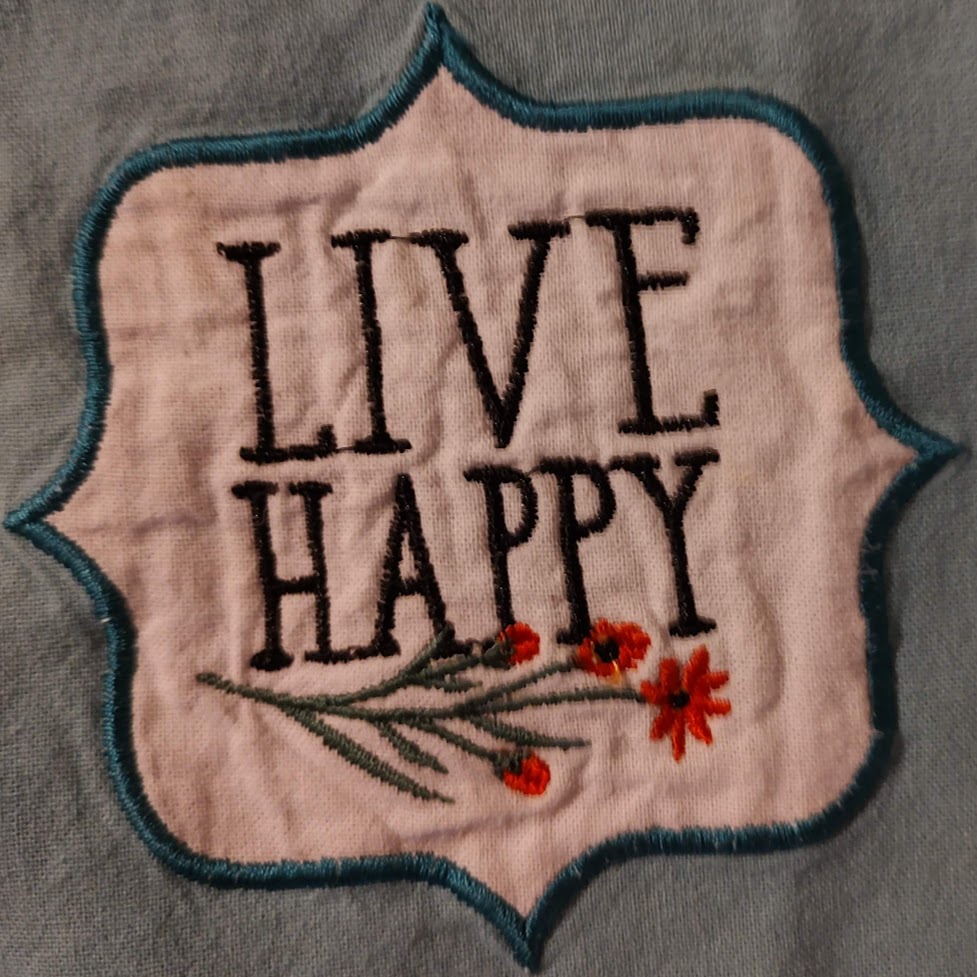
I programmed the camera to recognize a “Live Happy” logo that is on my wife’s apron. When the camera recognizes the logo it projects a 3D animated action figure walking around the logo. Once the image is tracked and the AR recognition has locked in place, you can move the device around and watch the AR camera match your movements.
Feel free to check out the APK (you’ll need to sideload it via developer mode on an Android device). One you load up the APK and install it on your device, open the app and point the camera at this logo:
One of the constant issues when working with legacy data is how ugly it is. When you’re calling a stored procedure to pull out legacy data from an Oracle Storage Management System backend, the resulting text string is formatted in a way that… Well, let’s just say its hideous looking, or at least we can say that it’s not human readable. Fortunately I’ve come up with a large library of conversion methods to take this data and format it into a way that will look good in the application front end UI. For example here’s a here’s a sample from my library that can take a MySQL timestamp and format it to look nice on a web page or application front end. To save critical UI space and help differentiate old records from new ones, the display shows a different format for how old the record is. For example records from today will simply say what time they were entered. Records from this week will have the day of the week and records older than that will have the dates. I use techniques like these frequently while handling the data conversion from where it’s stored in a legacy back in to being displayed on the modern front end user interfaces.
//********************************************************************************
function formatDateFromDb($timestamp){
    $time_object = new DateTime($timestamp, new DateTimeZone('UTC'));
    $time_object->setTimezone(new DateTimeZone('America/Los_Angeles'));
    /*echo("<p>records from last year {$time_object->format('m/d/y g:i A')} </p>");
    echo("<p>records from last week {$time_object->format('D F j g:i A')} </p>");
    echo("<p>records from current week (but not from today) {$time_object->format('D g:i A')} </p>");
    echo("<p>records from current day {$time_object->format('g:i A')} </p>");*/

    $current_year = date('Y');
    $timestampyear = date('Y', strtotime($timestamp));
    $current_week = date('W');
    $timestampweek = date('W', strtotime($timestamp));
    $current_day = date('N');
    $timestampday = date('N', strtotime($timestamp));
    $current_hour = date('H');
    $timestamphour = date('H', strtotime($timestamp));
    $prettyDate = "";


    if($current_year - $timestampyear > 0) {
        //records from last year |  03/08/21 3:41 PM
        $prettyDate = $time_object->format('m/d/y g:i A');
    } else {
        if($current_week - $timestampweek > 0){
            //records from last week | Mon March 8 3:41 PM
            $prettyDate = $time_object->format('D F j g:i A');
        } else if(($current_week - $timestampweek == 0 && $current_day - $timestampday >0) || ($current_week - $timestampweek == 0 && $current_day - $timestampday == 0 && $timestamphour < 8)){
             //  records from current week (but not from today) |  Mon 3:41 PM
            $prettyDate = $time_object->format('D g:i A');
        } else if($current_week - $timestampweek == 0 && $current_day - $timestampday == 0 && $timestamphour >= 8){
            // records from current day | 3:41 PM
            $prettyDate = $time_object->format('g:i A');
        } else {
            $prettyDate = "time format not found for {$timestamp}";
        }

    }
    return $prettyDate;
}
//-----------------------------------------------------
//^^^^^^^^^^^^^^^^^^^^^^^^^^^^^^^^^^^^^^^^^^^^^^^^^^^^^^^
There are many great uses for a full screen overlay. You can add splash screens, user interface elements and other features. Here is how to add a full screen overlay to your Unity Project.
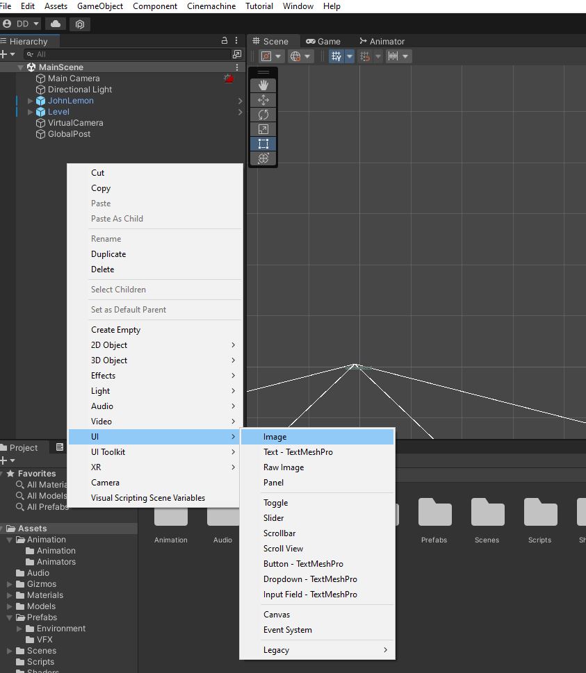
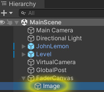
To start with go ahead and create an Image GameObject.
In your hierarchy, right click and choose ui->Image.
This will add the Image Game Object as well as the Canvas as its parent. An EventSystem is also added.
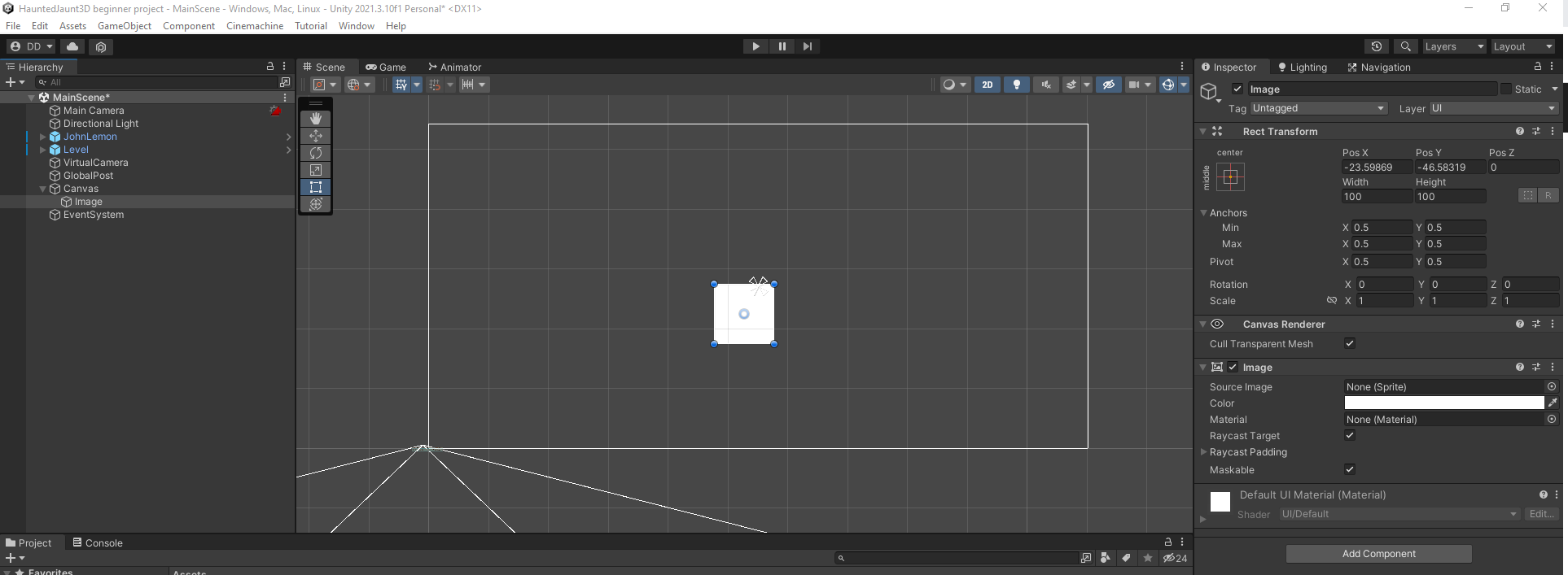
To get a good view of the new Canvas Image element, make sure to enter 2D mode. Then you should select the Canvas GameObject in the Hierarchy, then place your cursor over the Scene and press F. Use zoom and scrolling to get your comfortable workspace settings.
Depending on your project you may want to take a look at the EventSystem GameObject. There are components attached to it which enable user interaction with any UI elements you might add to the project. If this does not apply to your project, you are free to delete the object from the hierarchy.
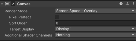
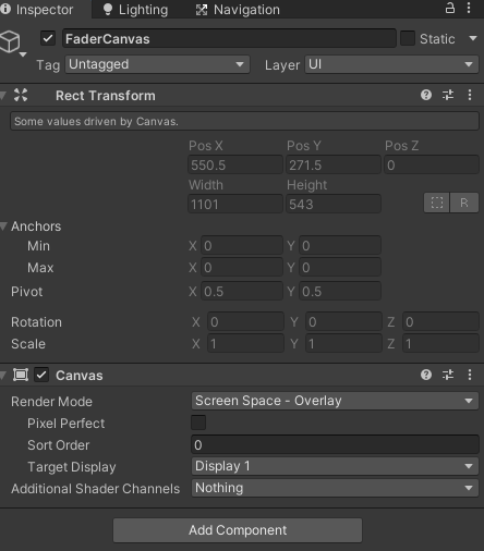
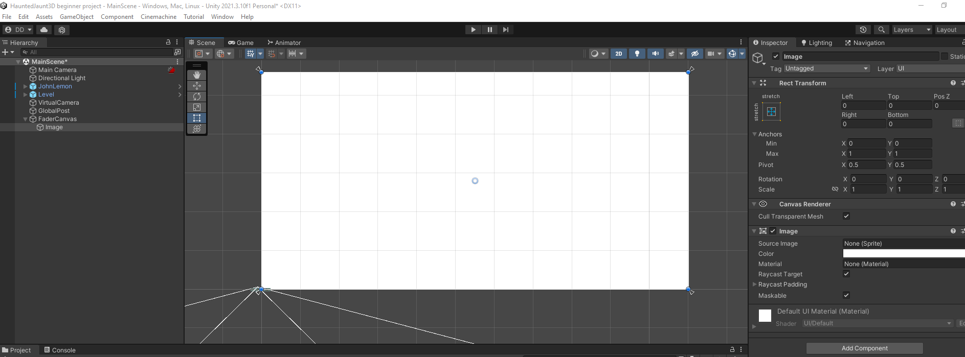
Looking at the inspector on the Canvas GameObject, the Canvas component has a RenderMode that should be set to the default of ScreenSpace – Overlay. This will stretch the image across the screen and ensure it is on top of any other content.
Screen Space - Overlay, where the Canvas fills the screen and all the UI elements of the canvas are rendered on top of everything else
There are two other components on the Canvas object: the Canvas Scaler and the Graphic Raycaster. The Canvas Scaler is a way of controlling the relative sizes of the UI elements when they are displayed on various screen sizes. The Graphic Raycaster is used to detect UI events. For example, when it detects a click, not only will it determine which UI element was clicked on, it will send the event to that element to be handled by the appropriate component.
We don’t need those two components for this project, so feel free to remove them from the Canvas GameObject.
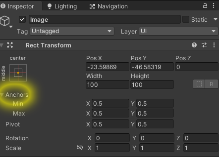
Now we need to configure the Rect Transform component:
1. Make sure that the Image GameObject is selected in the Hierarchy window.
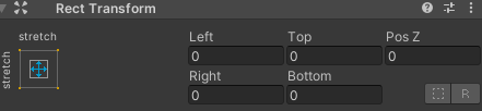
2. Find the Rect Transform component in the Inspector, then expand the Anchors setting.
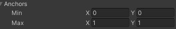
3. Set the minimum values for x and y to 0. Set the maximum values for x and y to 1.
Now that the Anchor area of the Image is the whole screen, we no longer need an offset. Make sure to set the Left, Top, Right and Bottom properties to 0 on the Image’s Rect Transform
Your image now covers the entire screen and will stretch and move as needed depending on the screen size of the user’s device. I look forward to seeing what can be done with this, from start screens, end screens, custom user interfaces and more!
I have a wide variety of Metaverse scripting skills, as well as 3D sculpting, modeling and design. Please check out the samples.
I have certifications in 3D sculpting, modeling and animation using 3D Studio Max. I also have skills using Unity, Blender, True Space 3D, Maya, Poser and Bryce


